Prompt:
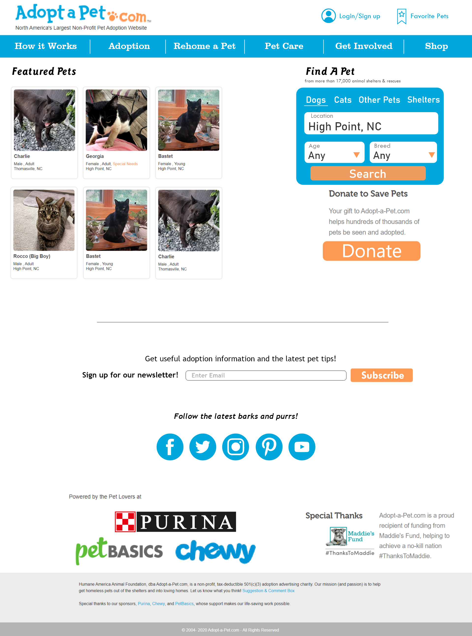
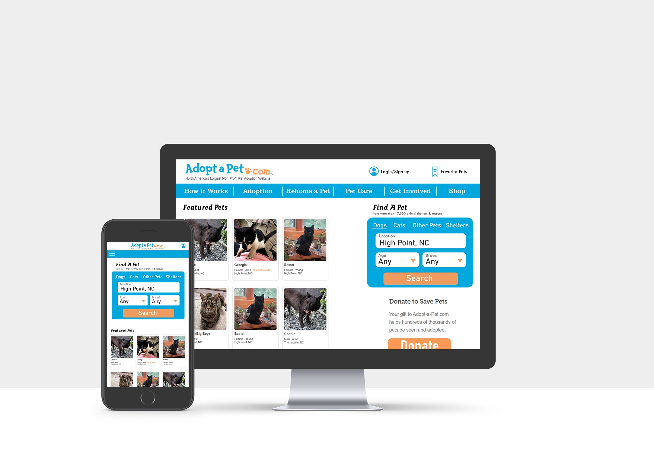
For this assignment we were instructed to redesign an existing website. I chose adoptapet.com.
Result:
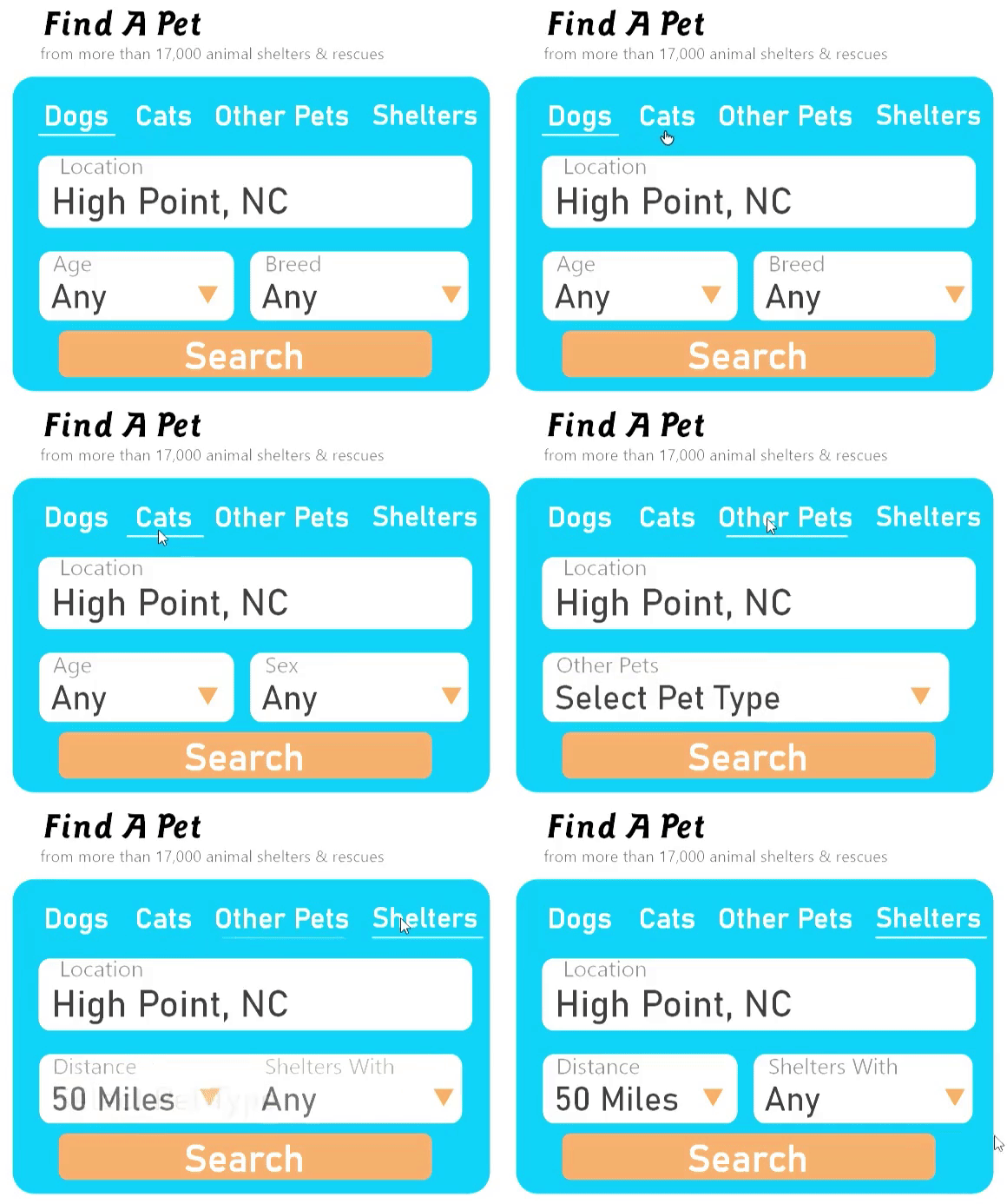
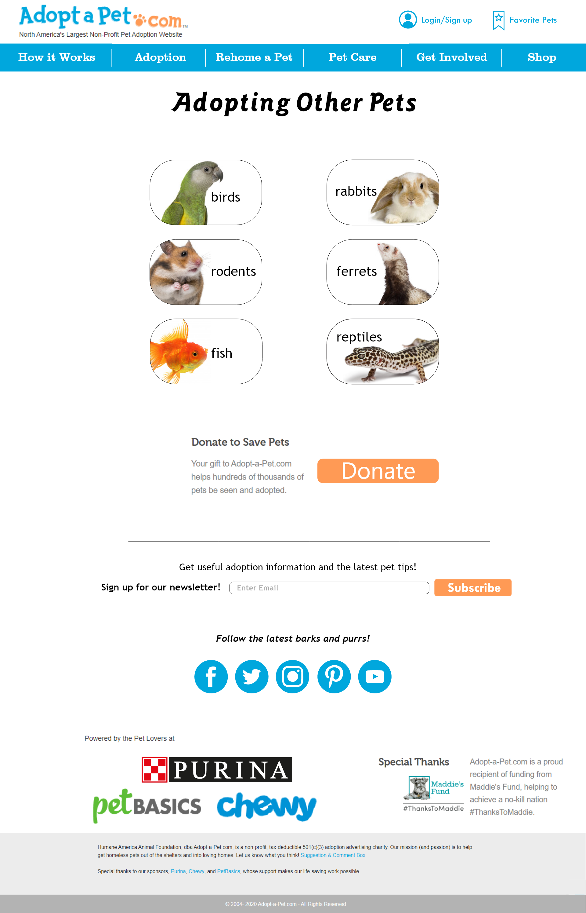
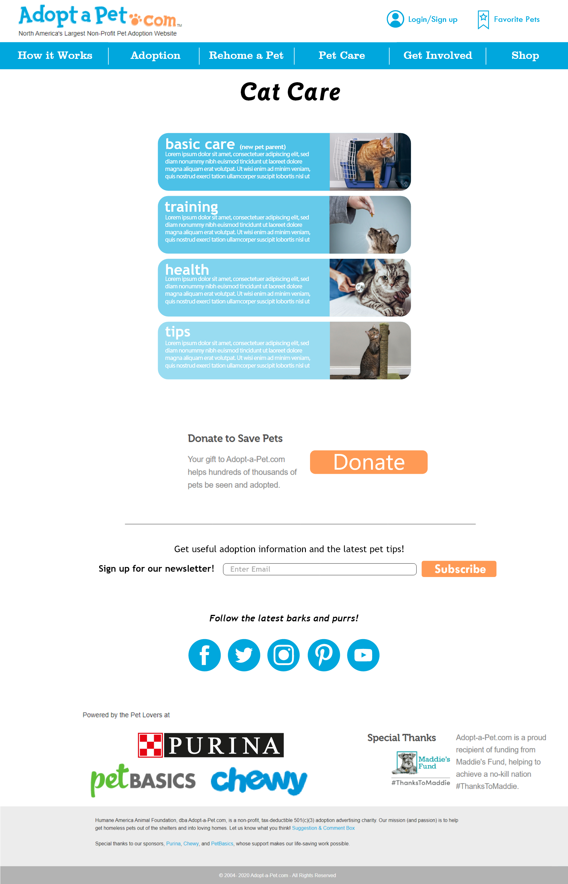
For this redesign I started with simplifying the layout. A lot of sections were bulky with text and had repeating information that was on the same page. I combined some of the menu bar options to make it more streamlined and cohesive. I tidied up the logo, placing the ‘.com’ next to the rest of it instead of under it. I also created a popup for the donation button instead of it taking you to a completely different page. This was my first time working in Adobe XD and really seeing a webpage come to life.

