Prompt:
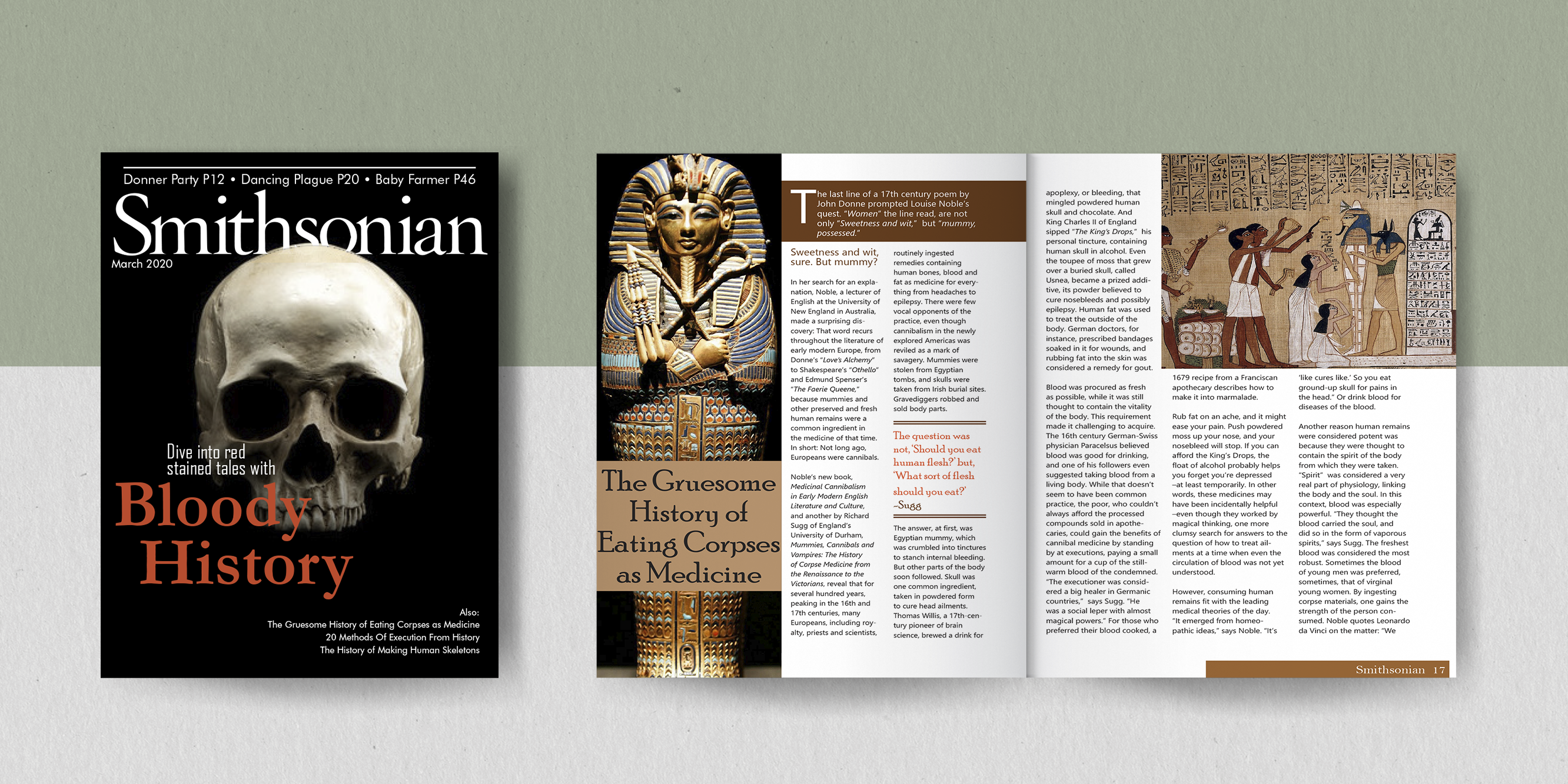
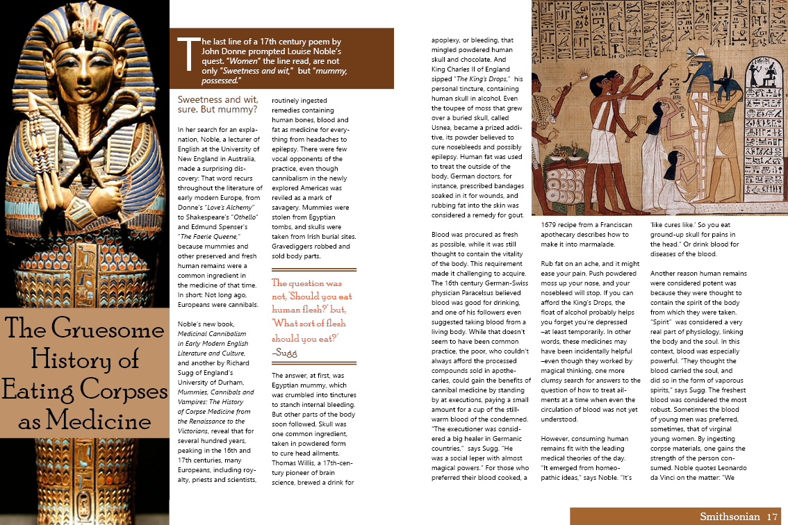
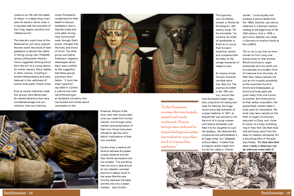
For this project we were tasked with selecting an online article and creating a magazine layout for it. I chose this article because it was genuinely interesting to me.
Result:
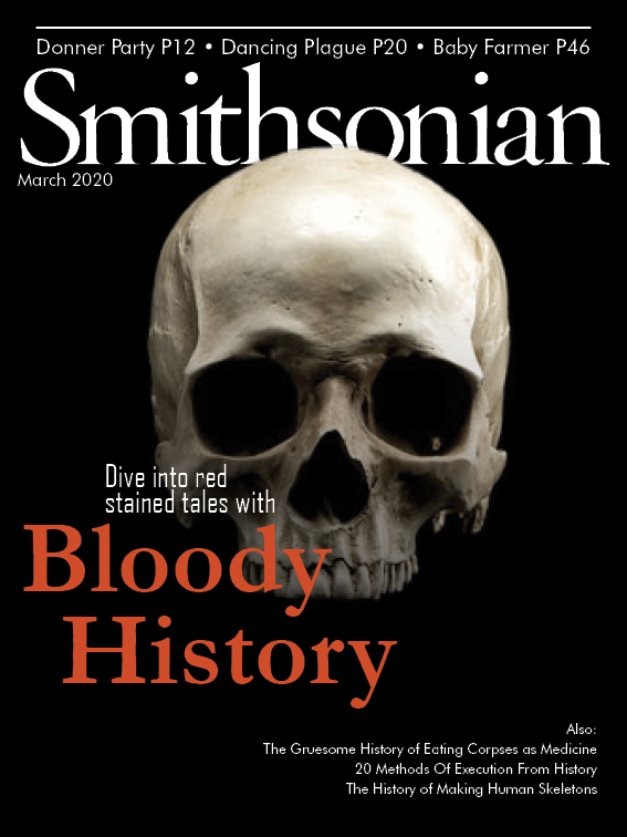
While working on this project I encountered a lot of orphans and widows. It took a lot of shifting the baseline and moving images, as well as the space around the images before I was able to create a cohesive spread that I was happy with. Later on, I created a mock cover for the article, drawing a lot of inspiration from Smithsonian magazines.


